Meta Narrative: Avril Lavigne
Avril Lavinge's image seems to have changed a lot from her "Sk8ter Boi" days to her star image now, yet it seems she hasn't strayed that far from her genre compared to some artists despite undergoing a change of sound. Perhaps this is due to her success at establishing a name in music and a solid fan-base. Having said this though, Coldplay are also very well established and have an even larger fan-base, yet their star image has undergone a massive transformation, just as their music has. Although Coldplay are one of the most famous (arguably the most) in the western world and therefore can afford to experiment and undergo different transformations. Whilst Avril is well established in her genre and most people will recognize her name, her fame isn't quite as comparable to artists such as Coldplay or Beyoncé.Let Go- Released June 4th 2002
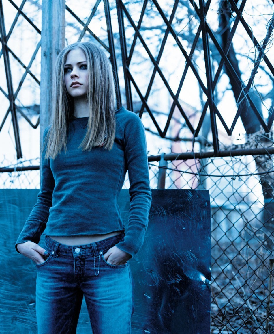
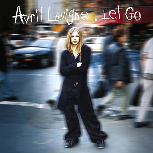
"Let Go" was Avril Lavigne's début album at the young age of 17. Still being a teenager, the singer's demographic was most probably aimed at people of her age. Lavigne's sound at this point was mainly associated with alternative rock/pop rock. The initial star image of Avril was a misfit teenager perhaps belonging to a "skate clique". The album has a heavy metal tinge to it at times as well as acoustic tracks discussing coming of age problems. Raw, electric guitar seems to be the main instrument of this album, its heavy metal/rock sound encapsulated through the stencil/scribbled font. Both typography's connote to rebellious teenage youth, particularly through the freedom of the fonts. The iconography she has chosen for her singles/album use quite dark and rock-related hues, perhaps reflecting a punk/rock sound at the same time as the serious tone in some of her songs. Although the colour lacks brightness, there still remains a variety of hues contrasting to her following album which pretty much sticks to a black, white and red colour scheme.
For a début album, the iconography and typography is probably at the height of its importance during the career of the performer. This is because it will always be what any future albums will be compared to and attract an initial audience. For this reason, capturing the attention of the right audience is important since jumping from one demographic to another is not an easy thing to pull-off successfully. Typically, as any début album will demonstrate to establish who the main performer is, Avril Lavigne takes centre stage; although her hunched posture, crossed arms and dark clothing don't signal a perky selection of songs. Let Go features a blurred urban background perhaps reflecting some of the feelings of teenage isolation explored throughout the album, as well as Avril's vision of her place in the tough, uncompromising world. None of the iconography on the album artwork connotes to an idealised and perfect reality more mainstream artists tend to present, but rather an honest, tough and normal teenager who is trying to understand her confused identity.
Under My Skin- Released May 25th 2004
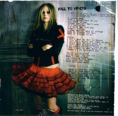
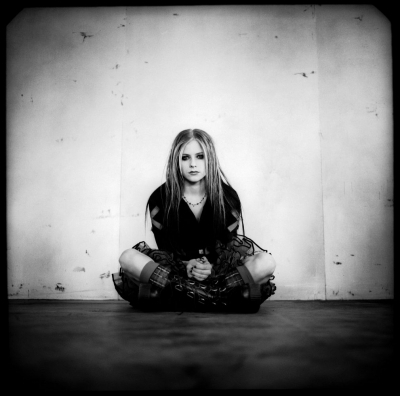
After gaining global success from her début album, Avril's initial experimental rock sound developed into something more sombre, maturing a little but not straying far from her established image. I think this is the point at which her star image became slightly more stylised- which is evident from the bold Goth skirts, corsets and Goth boots she wears for most of the album artwork of Under My Skin. The initial range of dark blue and green hues of Let Go transformed into colours evoking the new Goth-rock edge to her music- blood red, black and white. What remaining colour there was in Let Go was lost with Under My Skin; the serious colours and iconography, as well as the title signal a deeper look into her identity, shedding more of her skin and showing us the black-and-white reality of her experiences. Rather than the simple straight-on posture we see for her début album, the photography catches a glimpse of Avril on her way to guide us deeper into her world on the musical journey, almost reluctantly.
The worn, raw and Gothic iconography is further emphasised through the use of analogue film for the photography and mismatched stencil type-face (for main titles) and type-writer font (for text). The type-writer font often triggers connotations of a by-gone era, fitting nicely in with the dark, romantic reality of "Gothicism". The rebellious and passionate stencil font however, modernises the initial Victorian connotations to Gothicism. This stencil font is notably imperfect, just as the type writer font occasionally appears smudged here and there, purposefully reflecting the imperfections and struggles of Lavigne's life and personality discussed through her music. Analogue film has previously been used to reflect a retro tinge to an artists music, which can also be said for Avril- perhaps the punk rock era of the 80's. I would argue however, the disintegrating film reflects the breakdown of her barriers, almost as if she is peeling back the protective layer of her skin to reveal the raw truth through her music. The combination of these aesthetics reflect the sombre lyrics and melody lines as well as inner turmoil, confusion and anger, rather than the violent and enraged voices of heavy metal/punk rock from which Lavigne clearly drew upon for inspiration. My personal opinion is that her love for the simple power of acoustic music has softened and complimented the heavy electric guitar and drums throughout the development of her meta narrative, despite pulls in different directions within the rock genre.
One of the lead singles for Under My Skin:
My Happy Ending
The Best Damn Thing- Released April 17th 2007


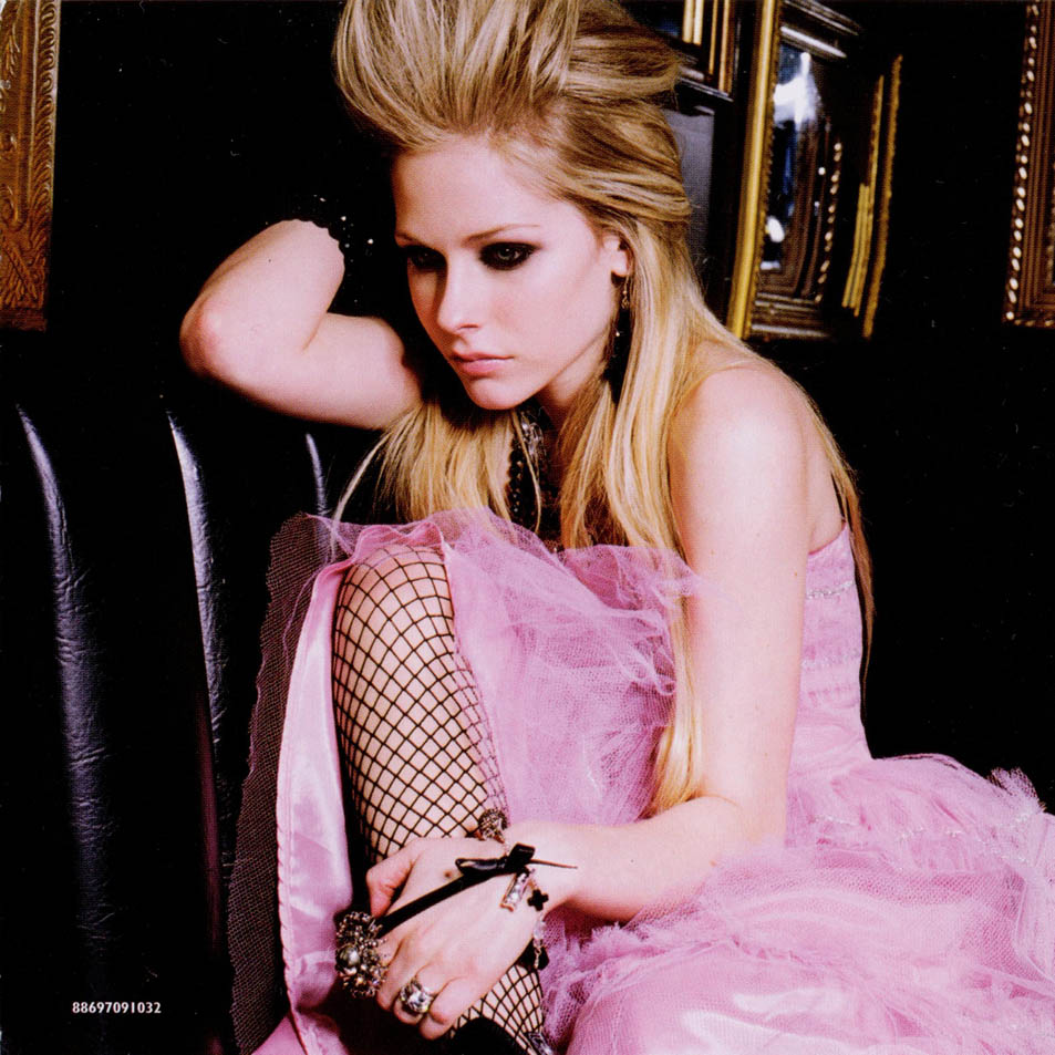
By the time The Best Damn Thing came out, most of the world was familiar with Avril Lavigne. After two very sombre and serious albums, the mood became more light-hearted both through the iconography and the music. After experimenting with various rock influences with the past two albums, the colour of pop somehow managed to seep through, giving rise to hits such as Girlfriend and Hot, again, whilst staying true to her established pop rock genre. Most critics refer to this album as Avril's "most commercial effort" probably due to her conforming to some of pop's conventions, one of which is voyeurism. In many of Avril's music videos and promo shoots for The Best Damn Thing there is a voyeuristic aspect to her performance in costume, body language and camera positioning. The video for her single Hot is a prime example of this, particularly during the scene where Lavigne wears an emerald corset, fishnets and shorts. Throughout the music video are also shots where the camera is positioned in a low-angle perspective, not only empowering Lavigne, but also idealising her beauty in a certain way. The frequent costume changes, emphasized use of make up, increase use of accessories all conform to a pop image. Indeed, compared to her previous tomboy "star image", her physical assets have become more emphasized and stylised at this stage of her musical journey, presenting a rock star personality more than a person.
Hot
Evidently, pink was the iconic hue for this stage in her meta-narrative, presenting two alter egos simultaneously- the pink pop princess and the punk rocker. Just as Under My Skin combined two styles- gothicism and modern rock, The Best Damn Thing combined more mainstream ideals- the preppy, high school style and the rock chick. Although it's a small change, Lavigne's original chestnut hair colour was dyed to a more conventional blonde perhaps to complement the pink theme, but it also conforms to a more generic stereotype of a pop-princess, much like when Britney transformed into her "adult" self and bleached her hair blonde. The skull bones and heart in my opinion demonstrate this combination- the heart and bones connoting to high-school doodles whilst outlined in a punky pink. All of the bright colours of the iconography signal the light-heartedness of the lyrics and the energy of the album when compared to previous darker, sombre colour palettes, again reflecting the energy of the album. The use of black colour has seriously been toned down, but still remains on the cover and an important part of Avril's rock identity. Although Avril's dress sense seems to have become slightly more feminised and trendy, her trademark panda eyes make-up and attitude remains the same. Along with the sombre colours and the goth rock clothes, The Best Damn Thing omitted the rebellious stencil font over a standard serif font similar to Times New Roman to evoke a more generic sound aimed at mainstream listeners. The secondary typeface, however does maintain the idea of mis-matching letters, even though, just as everything else, it has become slightly more styalised. This second font connotes to magazines and associates itself with the more "preppy" side of Avril's star image. The dark colours may have been toned down with the high-key lighting and use of white to combat the darkness, but black is nevertheless the colour that remains throughout all of Avril's albums and star image transformations, maintaining her rock roots.
Goodbye Lullaby - Released March 8th 2011
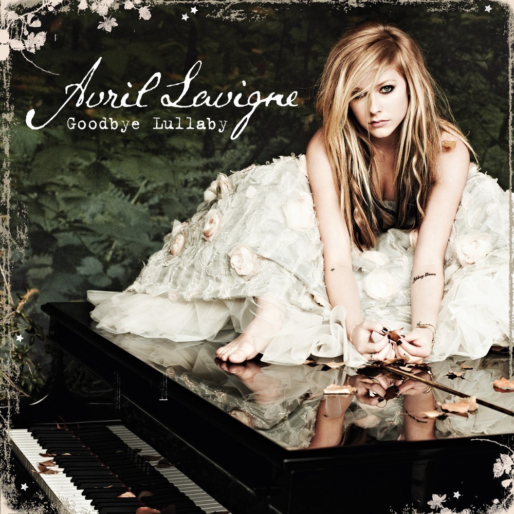
Simply the presence of a grand piano on the cover of this album suggests Avril's experimentation with a more acoustic sound. Contrasting to the previous, rather commercialised and pop-princessy front cover, the iconography of this album suggests a return to the personal lyrics rather than just songs to fill up space. Just as pink was the key colour for The Best Damn Thing, Green seemed to be a recurring motif in the music videos, photo shoots and iconography of Goodbye Lullaby. It's obvious that when we think "green", down to earth, softer, natural connotations come to mind during the synaesthesia process, echoing the natural acoustic sounds of the album. In addition to this, the rose petals, white ball-gown and the vintage frame work around the album evoke a sense of romanticism and a more natural image rather than the glamourised punk rocker of The Best Damn Thing or the tomboy of Let Go. Through keeping the darker colours she is not dismissing her initial goth rock image, but constructing and developing her star image piece by piece through combining this with the pale cream gown which maintains the brightness of her previous album, resulting in a new acoustic rock image. In fact, if I were to compare the sound of this album to Lavigne's previous work, I would say it is most similar to Let Go simply for the same balance between rock and personal acoustic tracks on the record.
Goodbye Lullaby saw the return of the stencil font and the typewriter font as displayed above and below. The stencil font was mainly used on the artwork of the singles that were more upbeat and playful than the rest of the album, rather than the romantic, slightly imperfect hand written font. Both the main curly typography and typewriter font connote to by-gone times. You can almost see the tinge of the old gothicism through the romantic connotations of the typography and the iconography of this album cover. It interesting to see how Avril has managed to chose colour themes that connote to two opposite ideas at the same time- the pink connotes to both punk and pop, and the green colour theme both reflects the down to earth acoustic sounds of Goodbye Lullaby at the same time as punk rock.

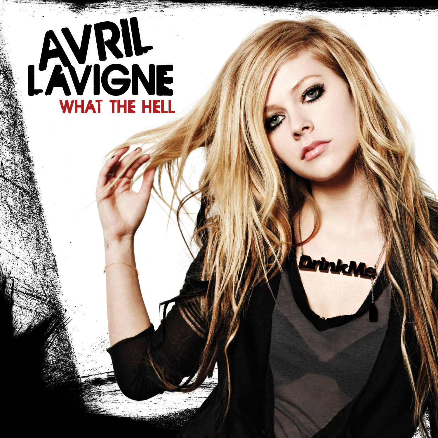
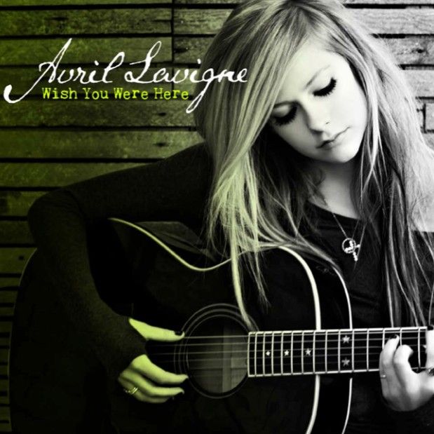
Similarly in Avril's music videos there is a balance between a rock/indoor setting and a natural setting. The two videos below demonstrate this contrast between the romantic ballad and the rock song. There is a clear difference between the colour palettes of the two songs also; whilst Wish You Were Here mimics the natural and faded hues of the album cover, Smile uses the bolder shade of green to reflect Avril's rocker attitude belonging to her genre. It is this balance between rock and acoustic that is uniquely encapsulated through Avril's iconography and typography that makes her a unique artist.
Wish You Were Here
Smile
Although Avril's audience hasn't changed drastically by this point, the youthful, rebellious image of Lavigne and topics of her songs maintain a young audience. Perhaps, due to the more mature sound of this record, the target aims at the lower part of the spectrum between the ages of 13 to mid twenties (although since more and more people have higher access to music now, the audience has broadened significantly). Starting out as a teenager and generally writing songs that discuss teenage issues, Avril has had the option of either going for a drastic change of image with each album and as a result a change of audience, or gain a gradual maturity as she grows up with her listeners, which is exactly what she has managed to pull off. She has most definitely not abandoned her initial star image like many performers struggle to do, but embraced her differences and nurtured that initial punk rock star image into something slightly more mature.
Avril Lavigne - Released November 1st 2013

The current stage of Avril's star image is the recent album release entitled Avril Lavigne. There is evidently a noticeable difference in the typography and iconography of this album compared to her previous (and particularly initial) albums. Once again, Avril isn't turning her back on her musical identity and has successfully managed to stay true to her genre and her fans. The two most iconic "Avril" symbols are the smudged panda eyes and the stencil type face. I would say the photograph used as the main background for this album is definitely more stylised than her previous one through the use of high key lighting, emphasis on make-up and a more mature hair do.
Avril's new album is supposedly a mixture of pop ballads and some of the old rock singles such as Here's To Never Growing Up. Although the single title suggests otherwise, Avril's image has certainly matured. The new album cover features a different version of Avril holding her head up high as a highly successful female musican compared to the initial rather rebellious image of her breakthrough album. Similarly, the stencil font has also matured into something more modern and sophisticated reflecting a more pop vibe to the new album, but the prescenece of black on the cover keeps Avril grounded in her established genre of rock/pop as well as the iconographic panda eyes.
Avril's new album is supposedly a mixture of pop ballads and some of the old rock singles such as Here's To Never Growing Up. Although the single title suggests otherwise, Avril's image has certainly matured. The new album cover features a different version of Avril holding her head up high as a highly successful female musican compared to the initial rather rebellious image of her breakthrough album. Similarly, the stencil font has also matured into something more modern and sophisticated reflecting a more pop vibe to the new album, but the prescenece of black on the cover keeps Avril grounded in her established genre of rock/pop as well as the iconographic panda eyes.
(Most of the info discussed in this post is sourced from Wikipedia)





No comments:
Post a Comment