Because our artist is still establishing her image within her genre, the changes that have taken place in Amanda Rogers's narrative have not been that drastic up until recently. Her "sound" is also a unique blend of jazz, blues, pop and rock influences which makes it that much harder to construct a memorable iconographic image to categorize. However, most of her songs seem to be classed as pop blues/indie.
Meta-Narrative: Amanda Rogers
Daily News - 2004

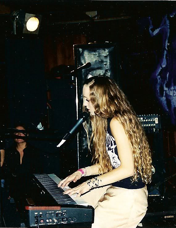
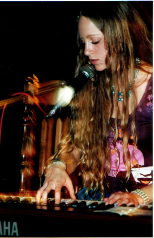
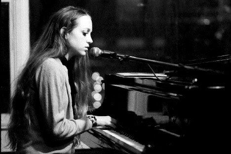
By the time Daily News came out, Amanda's music matured a great deal since the first album. The music maintained the grounded, simple and eerie sound of her haunting vocals with a piano lead, perhaps with more layers in her music and a less "guerilla-style" sound as her bio describes it. All of these tracks sound professionally recorded, compared to the previous album which contained some music layers that didn't sound like they were recorded in a studio, but had quite a 2D sound, lacking depth. The photography for this album also appears to have matured and has a more professional aesthetic compared to the previous album, which in my opinion wasn't portrayed to its greatest through the iconography. I think the iconography and typography for this stage of Amanda's star image works much better in establishing her image. I mentioned in a previous post how the typewriter font is often used to reflect a different, older period of time, working well with artists who draw upon older music influences or have a "retro" style. Being a performer who was greatly influenced by the jazz and blues genre, Amanda's music combines very well with the connotations to the typography. Her bohemian style is, again, reflected here through the halter-neck maxi dress, her iconic long hair and bare-footedness.
Something Borrowed, Something Blue - EP

I personally view this EP as the beginning of Amanda's "heartwood" phase in her meta-narrative. The presence of artwork for the cover of this EP represents her love for nature and contains some of the basic colours of the following Heartwood album. The word "art-rock" was mentioned in the biography on the Amanda's website in the context of discussing this EP. This genre emerged during the 1970's and (according to Wikipedia) attempted to merge rock with jazz and blues influences, something that is most definitely echoed throughout Amanda's music. If there would be one era in music with which Amanda would identify, I think the 70's would be the closest. Nature's role, not only in her music but in her general star image is apparent through the bohemian style of clothing she wears to the iconography of her website.
I think this is the phase where Amanda was getting the typography and the iconography right for her image. The typography immediately suggests a certain freedom about her music and works very well with the natural and positive colouring and illustration on the front cover.
Heartwood - 2006-2008

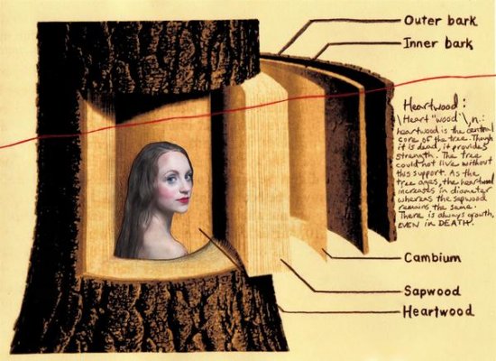
Compared to the other stages in Amanda's narrative, Heartwood is the album that stands out the most to me. This is about the stage where her passion for caring for nature started to seep through into her music and started to become a very important aspect of her official star image. It hadn't been so obvious before through the iconography and typography of the artwork, but is a key theme of this album. The very first track on this album begins with sounds of birds chirping and other natural music before the vocals begin introducing this theme. Whereas with the previous two albums, the eerie vocals and haunting lyrics were what united all the songs, with Heartwood it is the theme of natural beauty and embracing what's on the inside. You could go as far as saying that Heartwood is a concept album through the way Amanda used the metaphor of the "heartwood" of a tree for what she was experiencing. In the interiors of her album there is a diagram explaining this metaphor:
Heartwood is the central part of a tree trunk. It is apparently dead, yet without its support the tree would not be able to survive. According to the above image, "as the tree ages the heartwood part grows in diameter whereas the sapwood remains the same". The idea of the dead yet vital part of the tree reflects the importance of recognizing self-beauty coming from within. The sapwood external to the heartwood "remains the same", but the inside changes and grows, just as the true nature and being of a person will grow and continue to support it's physical vessel- exterior beauty. As you can see, Amanda and nature are represented as one being in the photograph above. She is central to the tree and this photo is very symbolic of how she sees herself in relation to nature. Through featuring a tree metaphor on the internal parts of the album as well as natural brown font connoting to forests and a photo in a wooded area, it's obvious how important the location of "the forest" is to this album which we incorporated into our own music video.
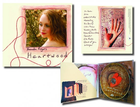
This album saw the revival of a couple songs from her more experimental first two albums, one of which turned out to be the most popular song of the record and our chosen track- This Beauty. The new Heartwood version of this song had many more musical layers, an increased tempo and clearer recorded vocals. The artwork for this album took this theme of nature very literally through the hand drawn typography and painted artwork which Amanda had created herself. Of all of Amanda's albums up to this point, Heartwood is the album that has a stronger "pop" influence. This can be heard through the typical verse/chorus/bridge structure and a variety of musical layers and motifs.
Compared to Daily News and The Places You Dwell, Heartwood is a more positive album, featuring more up-beat tracks contrasting to the sometimes sombre, quieter previous songs. This was our first sign that perhaps a more quicker editing pace than usual is required for this music video, to match the positivity and quick tempo of the song. The album reflects a sudden urge to embrace life, look after nature and has a generally more positive sound and outlook on the world. Heartwood screams sunshine, summer and forests which was taken into consideration when creating our music video. We did our best to incorporate these things into the construction of our music video, however with the short amount of summer days remaining we didn't want to compromise planning and research for lighting.
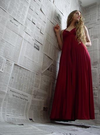
Below are some of the images from this stage of Amanda's meta-narrative from which we drew upon for inspiration.
WILD - Amanda's Current Star Image

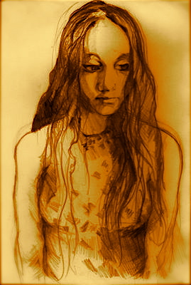
Amanda is currently going through the bridge between the Heartwood star image and the new WILD stage in her meta-narrative. This album hasn't been released yet, but the change can already been seen through the change in typography for the website and album and through the the promotional photographs (such as the one above). Her previous website design was closer to the appearance to her previous two albums- Heartwood and Hope From The Forgotten Woods, but with the new promotion the design has been updated to something replicating the new album artwork. It is a common convention for the design of an artists' website to become updated with each new album release, obviously to promote it. Evidently the bright cream, brown and pink hue combination of Heartwood has transformed into the sepia/black and white style displayed in the photo below, evoking the style of an aged photograph which still maintains her bohemian image but perhaps this has been stylised a little. If you observe the photograph of Amanda in the background below, the costume and intricate head piece as well as the general professionalism of the photograph are all signs of her star image maturing and channelling a specific bohemian star image. Over time, the more Amanda has created music, the more her star images have become controlled, contrasting to the blurry beginning which seemed a little blurry and less defined through the typography and iconography. Judging by the photo for the album artwork and the title WILD we may be able to guess the key location of the album will be open, wide areas, connoting to wildness and freedom and contrasting to the previous wooded and quietly beautiful areas of Heartwood and Hope From The Forgotten Woods.
Our aim has been to reconstruct the "Heartwood" stage in Amanda's meta-narrative. I think that throughout this process we've drawn upon influences from both this stage in her meta-narrative as well as the current star image; perhaps employing the professional, spacious feel of the new star image whilst maintaining the natural and imperfect feel of Heartwood.



No comments:
Post a Comment