The Album
Typically the album cover with include the name of the performer and the title of the album, perhaps not even this much information. Album covers initially arose due to the need to inform the buyer what it was they're buying. Album covers became more artistic a little before the age of the music video. It was turned into an art form. Many designs use the concept of releasing as little typography as possible to stimulate intrigue. Below are a couple examples of this...
The XX
Coldplay
Although album covers now tend to appear digitally more than physically, it is impossible for them to become extinct simply for the reason that they are what we identity our music by. Most of the representation of the music we are fed is through a visual medium, whether that be the artwork, posters, adverts on TV or billboards. They are also the first thing we see when we discover an artist- and discovering an artist by listening to their music prior to any visual stimulus doesn't occur nowadays as often as discovering artists through a visual stimulus such as seeing their album or an advert or even discovering them on Youtube. That's the case for me at least.
Conventions
Most albums consist of three things on the front as the bare basics for an album cover:
1. The album title
2. The artist title
3. An image or block colour of some sort
Albums tend to use a maximum of two fonts, at most- three, for the purpose of creating a uniform representation that doesn't signal too many different things all at once and doesn't seem too clattered. There is usually a primary font- one used either for the title (perhaps for more established artists) or the artist name- and a secondary font. The example that we looked at was Gabrielle Applin's album artwork. In this instance the primary font is the typewriter used for the name of the artist and the secondary was the curly font for the album title. Usually the image used on the cover will be where the other singles and visual representations stem from. For this reason, it's usually a memorable artist motif (such as the one for the XX) or a key image/location of the artist. In the case of English Rain Gabrielle Aplin's key motifs are the multicoloured balloons, umbrella and the flowers on the interior of the album.
The interiors of an album will be in-keeping with the theme established on the front and back, and don't necessarily require a central point of focus as the front cover might. In this instance Gabrielle's interior album design uses the same setting as the font cover but different motifs. The CD is simply an enlargement of the main motif. The sides of the album simply contain the institution logo, artist name, album title and serial number.
The busyness of the front cover varies for many different artists depending on their image and their sound. The back, however, more often than not uses a more simple design than the front, usually because there is more text to display on the back.
Typically the following are conventionally what you'll find on the back of an album cover:
1. Track-list
2. Copyright/Small print
3. Institution logo/Record company
4. (Sometimes) The Producer of the album
5. Barcode
6. (recent development) Website and other points of access e.g. facebook, twitter, tumblr (although these tend to also be printed inside, beneath where the CD is placed.

I think the simplistic nature of the album artwork both in the iconography and the typography matches the natural, acoustic and powerful yet soft vocals of the album. It's power in its simplicity is probably a reflection of Gabrielle's music, which is encapsulated perfectly through the artwork.
The Poster
More often than not, posters will be an enlargement of the album artwork, to save space and promote in the most efficient way possible. They do, however, tend to contain more information than the album cover itself and will provide different access points for the music.


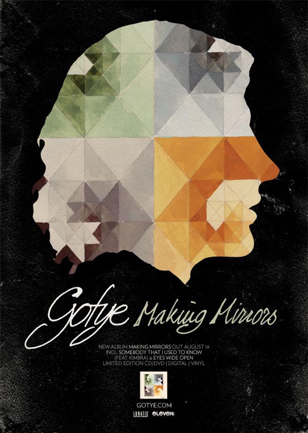
Gotye - Making Mirrors Poster & Album
As you can see, the main visual theme for Gotye's album has been replicated on the poster. It is the key motif for this album. The fact that it has been inserted into a silhouette of the artist shows us both what the album looks like and gives away an aspect of the artists appearance which may remind people of the music video. We also know that this is a solo artist as both the name and the solo image communicate his independence. The titles of the album and the artist are enlarged, however the name takes slight priority. Perhaps this is due to the album being his first to break into the mainstream and therefore an establishment of the artists identity is necessary. Other than this basic info, the poster features the release date, the hit singles that broke into the main stream, the website, record label and small print of the official album. Since the style of the album artwork featured in the music video which made it into the charts, it is a trigger for the viewers of the poster and a quick method of recognizing the artist. The overall "feel" of the typography and iconography working together reflects an unconventional artist, if anything. Seeing this poster for the first time, my assumption would be the artist favours acoustic instruments (natural style of font and warm watercolours connote to acoustic sounds) and is perhaps an "indie" musician (odd and unconventional connotations of artwork, natural and free flowing font- looks indie).
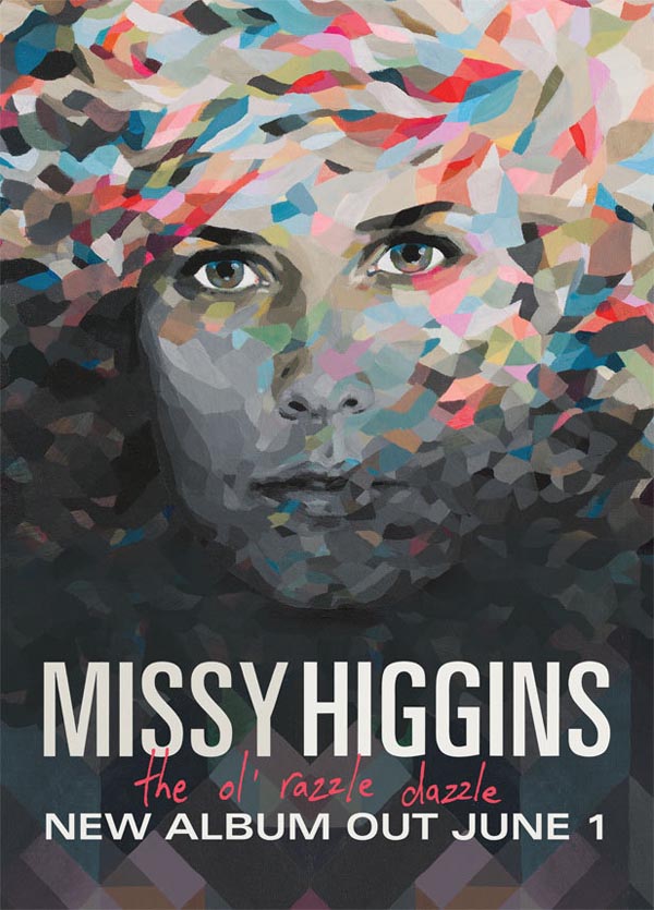
Missy Higgins - The Ol' Razzle Dazzle Poster & Album
 The artwork for this poster + album and that of Gotye's is very similar which is my reasoning for associating this artist's sound/genre with that of Gotye's. Coincidentally, these two musicians are from the same record company and share similarities in their music, but still differ greatly. The collage style artwork reflects the acoustic and percussion sounds of the album as well as fitting into a generic "indie" appearance much like Gotye. Both the album and poster contain limited information, the poster putting more emphasis on the release date than providing the viewers with access points.
Ben Rector - The Walking In Between Poster & Album


This final poster is a slightly different format to the previous two posters. This ad was most probably displayed either on a website or in a magazine, due to the square size of the image. Rather than connoting to an empty-electronic minimalistic sound that simplicity can sometimes connote to, this artwork reflects a simplicity that's something a little more down-to-earth. My first impression of this artist judging only by the artwork was singer/songwriter- similar to the style of Ron Pope, rather than an "indie" artist, or at least an "indie" artist who was different to the "indie" style demonstrated in the previous two artworks. Personally, I somehow find this format of poster less appealing than if the album would be the background image, maybe because your attention is channelled to the centre of the image, whereas if you saw an enlarged photo of the album, the information would be quicker to take in because there is nothing but the album in front of you. Also, the mind processes the images quicker than the text, so giving priority to the name than the image on the poster is probably what decreases the visual appeal. I think in general, there needs to be a balance of information so you don't give too much away but the image must appeal to the viewer.


No comments:
Post a Comment