Thursday, 20 February 2014

Ancillary Task: Final Products

1. Album Front Cover

Final Design
After much trouble, displayed above is our final front cover design for the album artwork of "Heartwood". We initially started editing the images, thinking we'd just tweak them and insert the other layers, but after maximizing the contrast we decided the photo looked the most professional. After the lighting, highlights, shadows and contrast were adjusted, we increased the temperature of the image on Windows Photo Gallery as this was the easiest and most efficient option, to reflect the warm hues portrayed in our music video. Once adjusted, the image was inserted into Publisher where it was cropped and grouped using the "Group" tool to combine the different layers into a single image. Initially, we planned on using our custom designed Amanda font, but after experimenting with the layout the cover seemed too busy since both the Heartwood and the Amanda font are attention grabbing. What our final design does that the initial design doesn't is it has a natural, central point of focus. Whereas with the previous design, the eye is drawn to the album title as well as the artist name.

Initial design


2. Album Back Cover


Once again, our initial plan was to use a different photo of Lorna displayed below. However we encountered the same problem- the image ended up being too busy once the text layers were added. As mentioned previously in our ancillary task research, often the front cover image is more busy than the back cover (excluding the typography), and having the planned photo of Lorna on the pathway wouldn't conform to this rule. Whilst looking through our photo shoot for the ancillary task, we came across the image above. The birdhouse seemed to fit in perfectly with the theme of nature, also reflecting the initial bird sounds on the first track of the album. The photograph also has a side-on focus, typical of the backs of album covers.In addition to this, we carefully selected the appropriate information an independent artist may have on the back of the album, whilst staying true to album conventions. 

3. Album Inside Right

As it is still winter, we had difficulty finding a flower appropriate for our CD slot, and so we went for something slightly different- but still better than the original idea. The head band is still in-keeping with the idea of nature and trees, whilst simultaneously making a link to the key location in our music video. It is also, needless to say, circular much like inside CD slot images.

4. Album Inside Left


This image reflects the key location of our music video for the leading single, and also is the only image of our artist represented in a long shot. We thought, since it's important for Amanda to be seen somewhere on the album, and this is an aesthetically pleasing photo we'd use it for the inside cover. The focal point also didn't lend itself to a typical front or back cover. When analysing the results of the photo shoot, we thought this photograph lent itself better to a poster image and an inside album image. This way, there would be a link to both the music video and the album.

5. Album Poster


Sure enough, this photo works a lot better on the poster promotion of the album. We made sure that although we didn't have a large image of the album, all of the colours used for the background and the text were in-keeping with the colour scheme. There are various visual pointers to the album, such as the Heartwood font, the red, cream and brown colour scheme. We also included conventional album reviews from appropriate independent sources such as "Under The Radar magazine" as well as "Rolling Stone", which Amanda Rogers was reviewed in at some point in her meta-narrative. The links at the bottom of the poster were also chosen based upon the most common access points indicated on her website; Facebook, Amazon and her website. In the end we chose to use the custom font we created on the poster as we thought it was an important link to the music video and also represented Amanda's sound very well. 


Tuesday, 18 February 2014

Ancillary Task: Photoshoot

Some of the results of our Ancillary task photoshoot.

Interior Album Photo Ideas:


Front Cover Ideas:


Back Cover Ideas:


Interior Album Ideas:


Monday, 10 February 2014

Ancillary Task: Final Designs


The final front cover will feature the Amanda Rogers font designed from scratch by Keeley and will be positioned just below the image of the heart. This photograph will be taken from a high-angle perspective, with a shallow depth of field, the background being Lorna wearing the white dress featured in the music video. The font for the album title has been chosen and downloaded and will be saved as an image an in-putted into Photoshop on top of the other layers. 


These are the interiors of the album. We are planning on shooting in the woods in Black park where we filmed for this still, however due to logistic problems we may have to chose a more local area. The flower will be brought separately and again- this shot will be a close-up with a shallow depth of field.


Our initial idea was to print our poster on the back of our album artwork which is displayed above. However, after consideration, we decided that due to time constraints, the printing and construction of this album artwork will simply not be possible. So we have decided to focus on printing and constructing the exteriors and interiors of the album. The poster design will simply be the heart image enlarged with the title underneath and the release date.


This is the sketch for the back of the album cover. We plan on having a long shot of Lorna in a wooded area where we will be able to tie red string to either side, which will join the string from the front cover, reflecting the motif in our music video. The track-list will be printed above Lorna in the downloaded Heartwood font.

Sunday, 9 February 2014

Marketing In Music Videos: Amanda Rogers

Marketing techniques today have changed a great deal since the peak of the music industry in the mid twentieth century. In the digital age, marketing is done in the easiest possible way since there are so many ways to reach the public and spread word quickly. In fact because of the variety of artists emerging onto the scene, we have more choice with whom we chose to listen to. The main marketing methods remain:
  • Posters - Nowadays these tend to be distributed in magazines, on-line newspapers and websites rather than distributed physically round an area- although many still opt for this method.
  • Promotional Gigs (now tend to be hosted on TV at special events) - Previously bands would tour areas, performing various songs from the album to be released and generate a hype up to and sometimes after the release date of their album. Nowadays, because of the large crowds and fan base sizes, these gigs tend to be at other live events- for example talk shows like The Ellen Show/David Letterman (US) or the Graham Norton Show, however independent gigs still do exist. Taylor Swift for example sent out an impromptu tweet advertising an un-planned performance on Hollywood Boulevard, New York to which thousands of fans turned up. She however has the fan base size to pull off such an event. 
  • Radio - Many artists still get a significant amount of radio play before an album or single will be released to see how well the song plays
Other methods of marketing include:
  • Social Networks- Twitter, Facebook, Tumblr, Soundcloud, Bandcamp, Myspace etc...
  • Word of mouth/Viral
  • Adverts- TV advertising tends to be used to promote

Amanda Rogers: Record Label & Marketing

Being an independent artist, Amanda has taken up a lot of the responsibility of constructing her image and marketing herself. She has been with various record companies and distribution companies, however when it come down to graphic design, she has mostly been the one behind its construction. Much like the system for distributing films, large institutions (such as Warner Bros) will have their own distribution companies under their belt and so they will receive most of the profits. Other, independent record companies and artists need to find independent music record distributors who will strike up deals and build relationships with stores and companies such as HMV or iTunes for example. The latter is the process Amanda Rogers has had to go through for the distribution of all her albums. Depending on how independent the artist is, the distributor will have to either strike up a contract with the actual artist or the record label.

(source of info: HowStuffWorks)

Below is an excerpt from a very useful article summarizing the different kinds of distribution available, from which this information was sourced.
Music distributors can be categorized in several ways:
  • Major label vs. independent -- Consolidation has left only a handful of major music distributors affiliated with the big record labels: Capitol/EMI Distribution (Time Warner), Sony/BMG Distribution, UNI Distribution (Vivendi Universal) and WEA Distribution (Warner Music Group). Independents can be national or regional. Among the independents, the largest is Curb Distribution.
  • Subdistributors -- These are the middlemen between large distributors and retailers. They could be one-stops, which sell from a number of different distributors, or rack-jobbers who actually own and run the record department within a larger department or multipurpose store.
  • National, regional or international -- While the major distributors operate on a national basis, area distributors are smaller and focus on a specific region of the United States, perhaps even a single metropolitan area. International distributors handle one or more overseas markets.
  • Online, Internet or digital distributors -- These distributors supply iTunes, YouTube.com, Rhapsody, Napster and other Web music stores with the tunes that they offer. These distributors may also offer physical CDs, or they may operate only in the cyber-sphere.
  • Niche distributors -- Some distributors specialize in and can be categorized by the type of music they handle, such as classical, Christian, country or alternative music.
  • Printed or sheet music distributors -- Although they only account for a small share of the market, some distributors are actually publishers or work for publishers to sell musical scores, band music, pop songs for guitarists and vocalists, and other "on paper" works.

In the specific case of Heartwood, the album was produced with D.I.T Records (Do It Together Records)- an independent record label and "boutique agency". According to the internet, boutique agencies "specialise in creative advertising", meaning they offer a completely tailored and unique advertising service. These companies tend to have small client lists and work with specific companies to achieve a particular "look or feel". The website contains an entire list of companies that work closely with the record label to distribute music and provide the graphic design. Amongst this list of familiar companies are two different record labels with which Amanda has worked for her latest album and the one preceding Heartwood- Make My Day Records "...is an independent record label based in Germany with a hand-picked selection of artists they believe in, not for politics or marketability" and 2nd Records "...is a record label specializing in indie-electronica music (Hamburg, Germany)."

The following is their "mission statement"-
"D.I.T. is a record label and boutique agency dedicated to promoting indie artists of all kinds. Many of our artists are self-reliant and have had much success on their own. D.I.T. is set up to provide its roster with a promotional team and a vast industry network that works together to facilitate bigger and better opportunities. 'For Artists, by Artists.'"

D.I.T. Records Website > http://www.ditrecords.com/

More artists from D.I.T Records
The following couple of artists share similar musical influences and (for the most part) belong to a similar genre to Amanda Rogers, despite the differences in "sound" between them. 

The Last Internationale 


Drift Division


Friday, 7 February 2014

Ancillary Task: Typography

According to the album artwork research we conducted as a group, there tends to be two main fonts present on the cover art, for the purpose of making it look structured and not too busy. As we thought the string was central to our music video and the most memorable, we thought it was absolutely important we make a reference to this on the cover artwork. Having searched through many font websites to gain ideas we couldn't find anything close to what we envisioned in our heads. During a creative session where we tried to draw out exactly what it was we were looking for, we decided that the closest we would get to achieving our ideal font is to simply draw it out and scan it in based upon a drawing our team member Keeley drew up (below).


The font would reflect the themes of the music video through being constructed in a thread-like style and intertwining into a heart shape much like in the music video and for added embellishment. The thread both fits in with our music video and represents the natural aspect of Amanda's star image.

Our primary concern was finding a font that would be the secondary out of the two. Our main idea was to find something rough and imperfect- perhaps something that even appears hand drawn to reflect the natural and imperfect themes of the music video and the album. Below are the different fonts we considered throughout our research for different reasons.


Points liked: Reflects a wooden  texture, looks carved and connotes to nature, not too artistic to draw attention away from the main font and title. Points disliked: A little too plain and unoriginal for the album, doesn't appear scruffy enough- hand written font is our preference

This was one of our favourite ideas, however the font style appeared too busy to work with our main font. The swirls and the general movement of the font across the page fits perfectly with what we were looking for though.
This font worked where it looked almost de-bossed into a texture and was our closest consideration for the album title- it also resembles the font for Amanda's album Hope From the Forgotten Woods.


This font worked really well and the style really connotes to "wood" but wasn't visually compatible enough with our primary font.  


This font was appealing but it resembled the primary font a little too much to work visually, although this was a step in the right direction.

This font connotes to everything that we were aiming for- innocence, trees and nature, but it seemed a little to perfect for the front cover. 

Our Final Font

We found this font on the website http://www.dafont.com/ called Stonehand Saul and thought it ticked all the necessary boxes. It reflected imperfection, and resembled an etching into wood which was what we were aiming for. The letters though were all separate which was also important to differentiate the primary and secondary fonts. 

The Amanda Font
These are the final typefaces that Keeley created ans scanned in. When designing these fonts, we were concerned as to how we were going to incorporate red thread into our font image. One of the solutions was to import an image of the red thread into Photoshop, but there was the risk of this looking unconvincing. The second was to simply fill the font with a single red colour. The latter is the result below. Surprisingly enough, the font ended up resembling thread in a more convincing way than expected. The first font below is our final image that will be used on the album artwork.


Conventions of Our Genre

The previous lesson we began to identify which music video genre our final project fit into in relation to genre using film languges. Amanda is quite difficult to place within a genre because of her unique sound and wide range of influences. When we were creating our music video, it seemed that our main focus was on portraying Amanda's star image and recreating the most accurate representation we could as opposed to focusing too hard on representing her genre in general. When we were trying to fixate on her genre it was hard to pick just one, so we narrowed it down to- piano rock/folk/alternative.

Conventions In Relation to Film Languages:

Mise-en-scene
  • Often use of retro/vintage inspired clothing to reflect older influences of music and evoke an aged sound with a modern twist
  • Natural Lighting is often favoured over artificially lit or particularly bright areas. 
  • Use of instruments in music video 
  • Exterior Locations (tends to be- this isn't a strict convention) 
  • Sometimes vintage filters used- e.g. black and white, washed out colour etc.
  • Not as wide a variety of settings used, generally 1,2 or maximum 3
  • Similarly a limited number of costume changes
Editing 
  • Not a very fast editing pace (strictly depends on the song though) 
  • When compared to other genres such as R+B for example, this genre doesn't shrink time as much. Of course, being a music video, the general convention is that generally time is shrunk in indie music videos, however not to a great extent as in other music perhaps. 

Camera
  • Generally steady shots- when shaky cam used- not to great extent, tend to be of nature
  • Slow panning shots, slow motion


Thursday, 6 February 2014

Ancillary: Purpose of Posters and Albums

Although we say we won't buy an album based on visual representation, it is a huge influence on the decision to perhaps research the artist further and check out their music. Not only does it serve the purpose of attracting attention but also representing the artist and their "sound" in the best possible way. The album is already technically one form of promotion, but the poster is a secondary promoting tool. So it's almost a promotion for the promotion.

The Album
Typically the album cover with include the name of the performer and the title of the album, perhaps not even this much information. Album covers initially arose due to the need to inform the buyer what it was they're buying. Album covers became more artistic a little before the age of the music video. It was turned into an art form. Many designs use the concept of releasing as little typography as possible to stimulate intrigue. Below are a couple examples of this...

The XX
Coldplay
Although album covers now tend to appear digitally more than physically, it is impossible for them to become extinct simply for the reason that they are what we identity our music by. Most of the representation of the music we are fed is through a visual medium, whether that be the artwork, posters, adverts on TV or billboards. They are also the first thing we see when we discover an artist- and discovering an artist by listening to their music prior to any visual stimulus doesn't occur nowadays as often as discovering artists through a visual stimulus such as seeing their album or an advert or even discovering them on Youtube. That's the case for me at least.
Conventions
Most albums consist of three things on the front as the bare basics for an album cover:
1. The album title
2. The artist title
3. An image or block colour of some sort
Albums tend to use a maximum of two fonts, at most- three, for the purpose of creating a uniform representation that doesn't signal too many different things all at once and doesn't seem too clattered. There is usually a primary font- one used either for the title (perhaps for more established artists) or the artist name- and a secondary font. The example that we looked at was Gabrielle Applin's album artwork. In this instance the primary font is the typewriter used for the name of the artist and the secondary was the curly font for the album title. Usually the image used on the cover will be where the other singles and visual representations stem from. For this reason, it's usually a memorable artist motif (such as the one for the XX) or a key image/location of the artist. In the case of English Rain Gabrielle Aplin's key motifs are the multicoloured balloons, umbrella and the flowers on the interior of the album.
The interiors of an album will be in-keeping with the theme established on the front and back, and don't necessarily require a central point of focus as the front cover might. In this instance Gabrielle's interior album design uses the same setting as the font cover but different motifs. The CD is simply an enlargement of the main motif. The sides of the album simply contain the institution logo, artist name, album title and serial number. 
The busyness of the front cover varies for many different artists depending on their image and their sound. The back, however, more often than not uses a more simple design than the front, usually because there is more text to display on the back. 
Typically the following are conventionally what you'll find on the back of an album cover:
1. Track-list
2. Copyright/Small print
3. Institution logo/Record company
4. (Sometimes) The Producer of the album
5. Barcode
6. (recent development) Website and other points of access e.g. facebook, twitter, tumblr (although these tend to also be printed inside, beneath where the CD is placed. 


I think the simplistic nature of the album artwork both in the iconography and the typography matches the natural, acoustic and powerful yet soft vocals of the album. It's power in its simplicity is probably a reflection of Gabrielle's music, which is encapsulated perfectly through the artwork.

The Poster

More often than not, posters will be an enlargement of the album artwork, to save space and promote in the most efficient way possible. They do, however, tend to contain more information than the album cover itself and will provide different access points for the music.


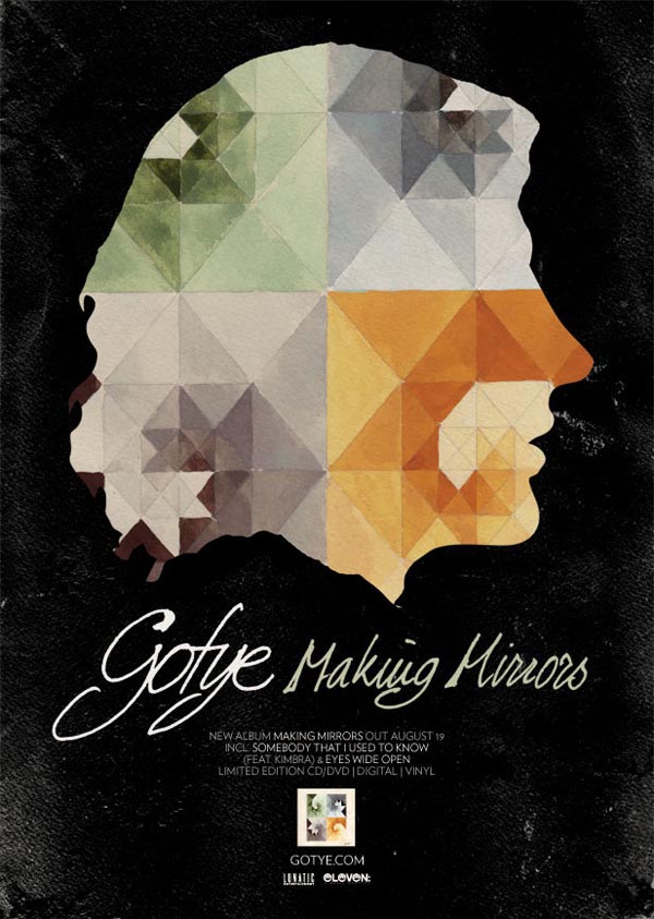
Gotye - Making Mirrors Poster & Album
Gotye Tour Art and Album Promo Design by WBYK


As you can see, the main visual theme for Gotye's album has been replicated on the poster. It is the key motif for this album. The fact that it has been inserted into a silhouette of the artist shows us both what the album looks like and gives away an aspect of the artists appearance which may remind people of the music video. We also know that this is a solo artist as both the name and the solo image communicate his independence. The titles of the album and the artist are enlarged, however the name takes slight priority. Perhaps this is due to the album being his first to break into the mainstream and therefore an establishment of the artists identity is necessary. Other than this basic info, the poster features the release date, the hit singles that broke into the main stream, the website, record label and small print of the official album. Since the style of the album artwork featured in the music video which made it into the charts, it is a trigger for the viewers of the poster and a quick method of recognizing the artist. The overall "feel" of the typography and iconography working together reflects an unconventional artist, if anything. Seeing this poster for the first time, my assumption would be the artist favours acoustic instruments (natural style of font and warm watercolours connote to acoustic sounds) and is perhaps an "indie" musician (odd and unconventional connotations of artwork, natural and free flowing font- looks indie).

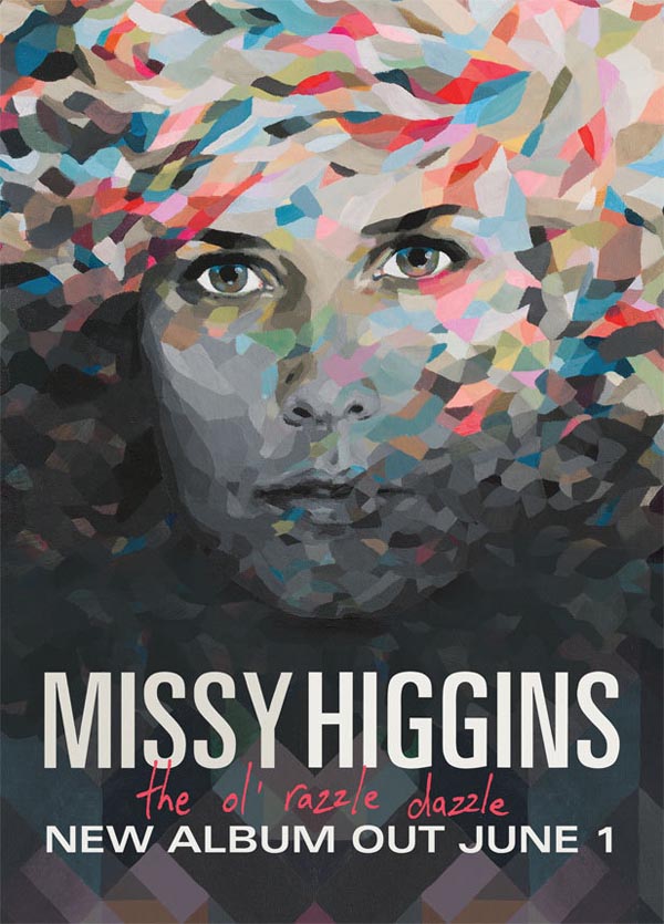
Missy Higgins - The Ol' Razzle Dazzle Poster & Album

Missy Higgins Album Cover Artwork by WBYK  The artwork for this poster + album and that of Gotye's is very similar which is my reasoning for associating this artist's sound/genre with that of Gotye's. Coincidentally, these two musicians are from the same record company and share similarities in their music, but still differ greatly. The collage style artwork reflects the acoustic and percussion sounds of the album as well as fitting into a generic "indie" appearance much like Gotye. Both the album and poster contain limited information, the poster putting more emphasis on the release date than providing the viewers with access points. 
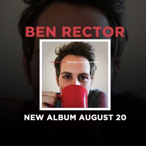
Ben Rector -  The Walking In Between Poster & Album 


This final poster is a slightly different format to the previous two posters. This ad was most probably displayed either on a website or in a magazine, due to the square size of the image. Rather than connoting to an empty-electronic minimalistic sound that simplicity can sometimes connote to, this artwork reflects a simplicity that's something a little more down-to-earth. My first impression of this artist judging only by the artwork was singer/songwriter- similar to the style of Ron Pope, rather than an "indie" artist, or at least an "indie" artist who was different to the "indie" style demonstrated in the previous two artworks. Personally, I somehow find this format of poster less appealing than if the album would be the background image, maybe because your attention is channelled to the centre of the image, whereas if you saw an enlarged photo of the album, the information would be quicker to take in because there is nothing but the album in front of you. Also, the mind processes the images quicker than the text, so giving priority to the name than the image on the poster is probably what decreases the visual appeal. I think in general, there needs to be a balance of information so you don't give too much away but the image must appeal to the viewer.